Browse Month

December 2022

NFTs and Video Games – a short-lived idea for 2022 / 2023?

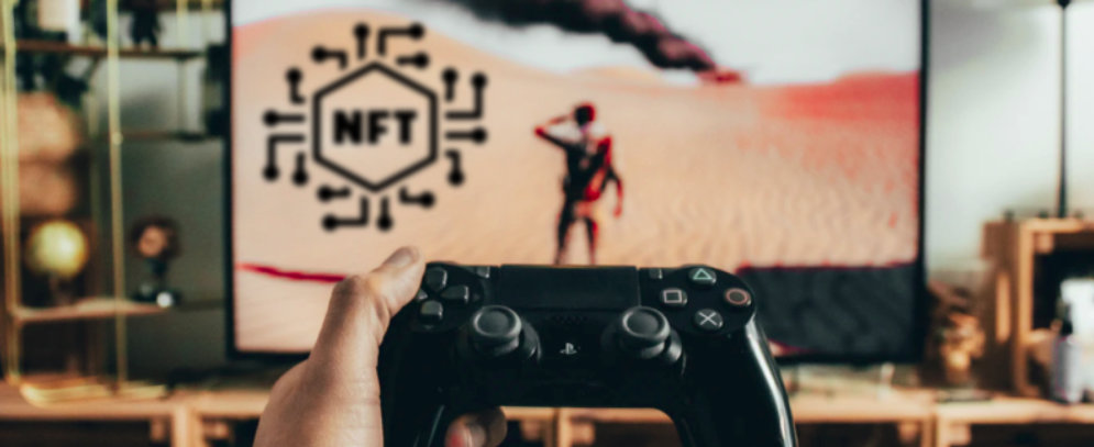
NFTs…. Love them or hate them? I hate them, personally.

Polygon ran an interesting read just recently: unfortunately for studios salivating at the idea of getting in on the crypto action in 2022, players largely revolted against it. Most plans for NFT integration were a disaster. And NFT controversies in the gaming world were so big this year that it even became a subplot of the Apple TV show Mythic Quest this season.

But it wasn’t just gamers who rejected crypto this year. The crypto market itself also went bust. The promised Web3 revolution that much of Silicon Valley was manically chattering about in 2022 not only never arrived, it actually collapsed into a speculative puff of smoke, thanks to a series of major economic crashes. And the world of blockchain technology, in general, is looking so grim that investors are, yet again, wondering if the entire space is over for good.

Read more: https://www.polygon.com/23521430/nft-video-games-crypto-failed-decentraland-axie-infinity

Designing Accessible Data Visualizations

Accessibility should be at the heart of every product, and it’s not any different for data visualizations. By making your graphs accessible, you not only ensure that everyone can use them but also that they are easier to understand.

Sarah L. Fossheim develops and designs software for the education sector and previously worked in cancer research. In medical software, for example, an inaccessible or confusing graph could lead to critical mistakes, such as giving the wrong medication to a patient.

To help everyone build better and accessible data visualizations that prevent confusion and misunderstandings, Sarah summarized ten dos and don’ts to keep in mind whenever you’re designing a chart or a graph.

https://fossheim.io/writing/posts/accessible-dataviz-design/

Dashboard Design Patterns

Dashboards present complex data sets at a glance. But what does effective dashboard design look like? How do you find the right balance between displaying everything that’s important and ensuring the dashboard is easy to use without overwhelming the user?

The interdisciplinary research lab VisHub at the University of Edinburgh published a set of dashboard design patterns to support the design and creative exploration of dashboard design. It dives deeper into every aspect of dashboards — from components and meta information to visual representation, interaction, and page layout. 

https://dashboarddesignpatterns.github.io/patterns.html

Good Design Principles

Establishing a set of design principles for a project or brand can help teams create more consistent user experiences. They aid decision-making and make it easier to keep the product aligned. If you plan to establish a set of design principles for your product, we came across useful resources that will help you get started.

Ben Brignell curates an open-source collection of 195 design principles and methods. It features both heuristic design principles and design principles developed by companies specifically for their products. All of them are searchable and tagged, from hardware and infrastructure to language and organizations.

https://principles.design/