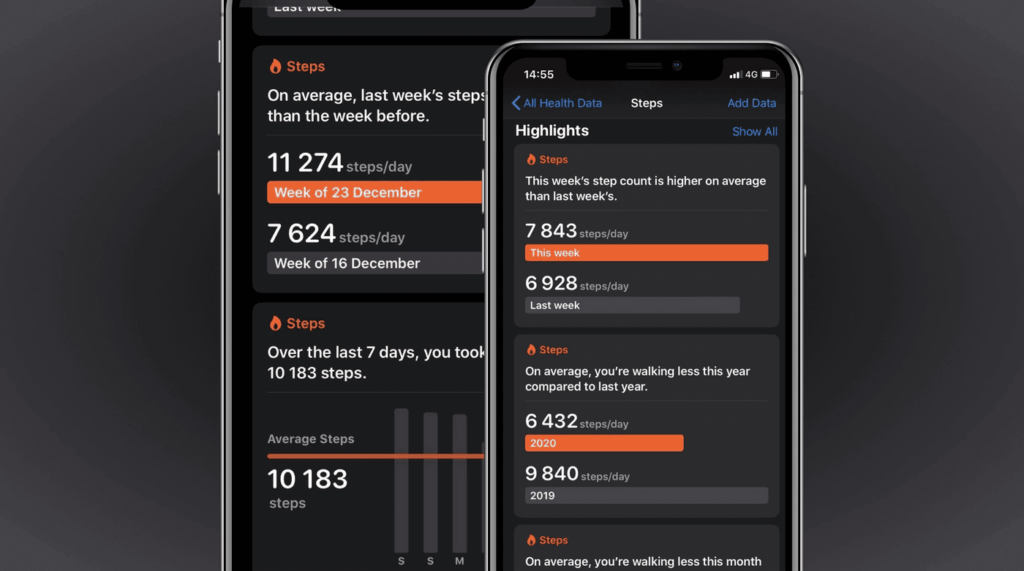
Accessibility should be at the heart of every product, and it’s not any different for data visualizations. By making your graphs accessible, you not only ensure that everyone can use them but also that they are easier to understand.
Sarah L. Fossheim develops and designs software for the education sector and previously worked in cancer research. In medical software, for example, an inaccessible or confusing graph could lead to critical mistakes, such as giving the wrong medication to a patient.
To help everyone build better and accessible data visualizations that prevent confusion and misunderstandings, Sarah summarized ten dos and don’ts to keep in mind whenever you’re designing a chart or a graph.
https://fossheim.io/writing/posts/accessible-dataviz-design/