No matter what kind of UI component you’re working on, there’s no need to reinvent the wheel. To make your work easier and shorten research time, the folks at UI Guideline analyzed some of the most popular design systems and UI libraries to standardize the design and code of more than 40 UI components. The result is the UI Components Handbook.
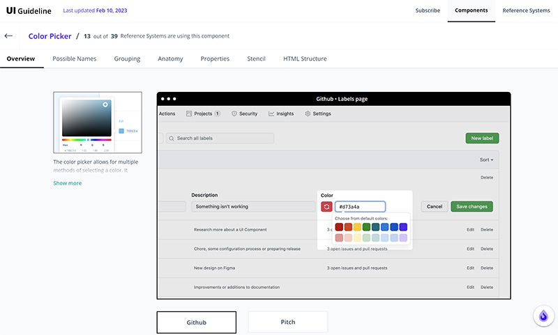
For each component, the handbook gives you an overview of real-world examples, anatomy, grouping, and properties of the component. The cherry on top is a ready-to-use Figma component that includes all the best practices and the ready-to-use HTML code that you can use as a starting point to code and style your own component.