SAG-AFTRA has announced a new agreement to protect performers involved in video game localization.
The Independent Interactive Localization Agreement will cover projects that are originally scripted and released in a foreign language and then dubbed into English. This agreement will provide performers with stronger AI protections and expanded work opportunities compared to the previous localization agreement.
GenAI news: In a groundbreaking move, the European Union has passed the world’s first comprehensive law regulating Artificial Intelligence (AI). Endorsed by a vast majority in the European Parliament, this legislation aims to safeguard human rights while fostering responsible AI innovation.
The new law categorizes AI systems based on their potential risks and impact. This ensures stricter regulations for high-risk systems used in critical sectors like infrastructure, law enforcement, and education. Developers of such systems will be required to:
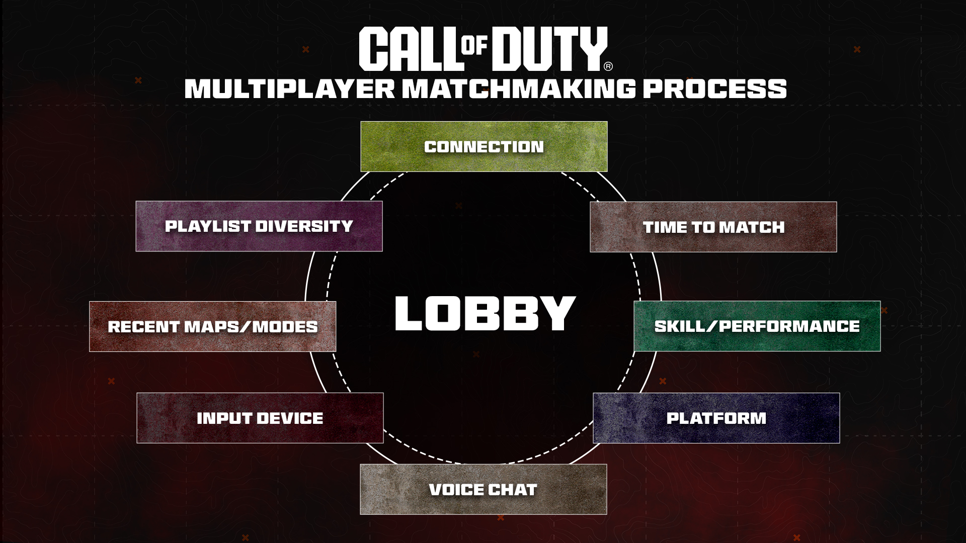
Fascinating insights have emerged from the developers of Call of Duty, shedding light on the intricacies of their matchmaking system, with particular emphasis on the contentious issue of skill-based matchmaking. The comprehensive breakdown reveals that the matchmaking process weighs eight factors in total, with player skill being just one of them. Notably, connection quality is the most heavily weighted element, closely followed by the time it takes to find a match.
This disclosure counters the prevalent belief among dedicated players and content creators that ping is no longer the dominant factor in Call of Duty matchmaking. Instead, they contend that skill level significantly influences matchmaking decisions, sometimes leading to players being placed in matches with higher ping to align with their skill level. The revelation also delves into the nuanced measurement of latency, indicating that the game utilizes Delta Ping, which measures the round-trip time difference between the nearest server and the server associated with the evaluated lobby. Although the blog assures that players typically connect to servers in close proximity, it hints that exceptions may occur, likely influenced by the time-to-match factor.
More information and the full blog post is here: https://www.callofduty.com/blog/2024/01/call-of-duty-update-an-Inside-look-at-matchmaking
I’ve been thinking about the layoffs and studio closures today. We lost a lot of talent this year, and we also lost some amazing studios (Volition being the one that struck me the hardest personally, having enjoyed their games since 1995 with Descent, Freespace (which I still fire up to this day regularly), Summoner and more).
A question was raised to me recently by a few people was: “what about those IPs? What is happening with them?”
Right now, based on what I have been told behind closed doors and what I know, I can foresee that most of these IPs won’t go on sale — just yet. We will unlikely see a firesale like we did back in the THQ / Atari days, largely because of two reasons:
Delving into the fascinating realm of video games, one might ponder the intrinsic value of an actor’s face in this dynamic industry.
Picture this scenario: You’re a performer, securing a role in a video game that requires just a single day of your time. The task is laid out plainly—they need to scan your uniquely distinct face to craft a meticulously detailed 3D model for a video game character. You sign the necessary paperwork, undergo the scanning process, and then, fast forward 2-3 years, you witness your own visage gracing the screen in a trailer unveiling a new playable character.
This exact scenario unfolded for actor and model Shahjehan Khan with the recent release of NetherRealm Studios (WB Games)’ Mortal Kombat 1. In a delightful and charming TikTok feature alongside WBZ | CBS Boston’s News Radio’s Matt Shearer, the Boston native shared his enthralling journey of becoming the face behind Quan Chi, a longstanding character reimagined for the series’ soft reboot as a DLC character. The story highlights the intriguing intersection of real-world performances and the digital realm, showcasing the lasting impact of an actor’s contribution to the immersive world of video games.
A few thoughts on the GTA6 trailer from Rockstar Games
The first GTA6 trailer, courtesy of Rockstar Games
Reflecting on the three generations that have passed since the iconic GTA: Vice City, it’s not just the expansive scope of the city that captivates but the remarkable quality of the character models that truly stands out. The evolution from the original 3D portrayal of Florida’s gem to the present is nothing short of astounding, especially considering the passage of over two decades.
I know the game is maybe 2+ years away still, but GTA 6 emerges as a true frontrunner, not only in terms of technical advancements but also in the realm of artistry. The photorealistic rendering of skin and hair, coupled with the breathtakingly lifelike animation, represents a colossal leap forward. This first trailer effortlessly dispels any lingering doubts about the prolonged gap since the last major GTA release. The sheer dedication, evident in the form of relentless effort, resources, and investment poured into this game, is nothing short of staggering.
It becomes clear that the wait has been well worth it, given the unprecedented level of detail and craftsmanship that GTA 6 will bring to the gaming landscape.
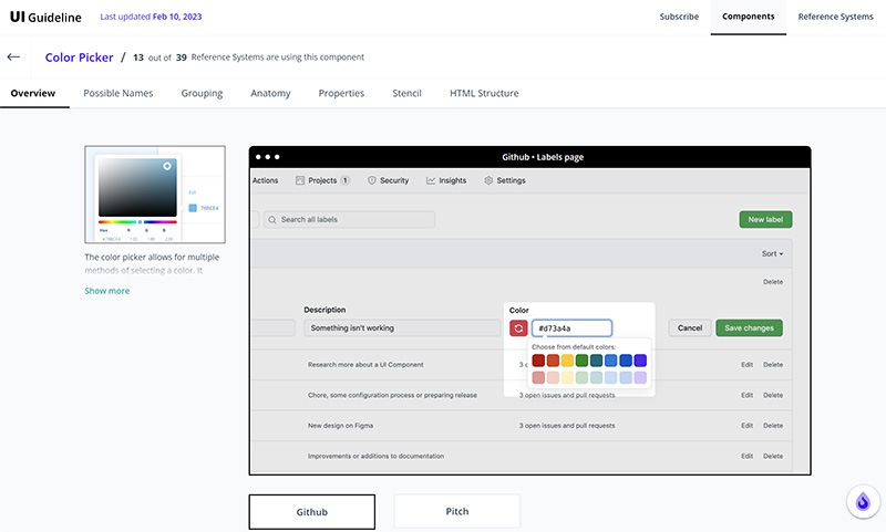
No matter what kind of UI component you’re working on, there’s no need to reinvent the wheel. To make your work easier and shorten research time, the folks at UI Guideline analyzed some of the most popular design systems and UI libraries to standardize the design and code of more than 40 UI components. The result is the UI Components Handbook.
For each component, the handbook gives you an overview of real-world examples, anatomy, grouping, and properties of the component. The cherry on top is a ready-to-use Figma component that includes all the best practices and the ready-to-use HTML code that you can use as a starting point to code and style your own component.
Authentication is a tricky subject; if done wrong, it can break a user experience. There are password rules that make it hard to remember the password we chose and well-meant security questions that might even lock us out of our accounts instead of providing an extra layer of security. And nobody likes to identify crosswalks and fire hydrants either. So how can we fix the authentication UX for good?
That’s exactly the question that Jared Spool explores in his presentation “Fixing The Failures of the Authentication UX.” He explains how to make authentication design a priority in your experience architecture and where the real risks are so that you can best protect your users — without frustrating them.